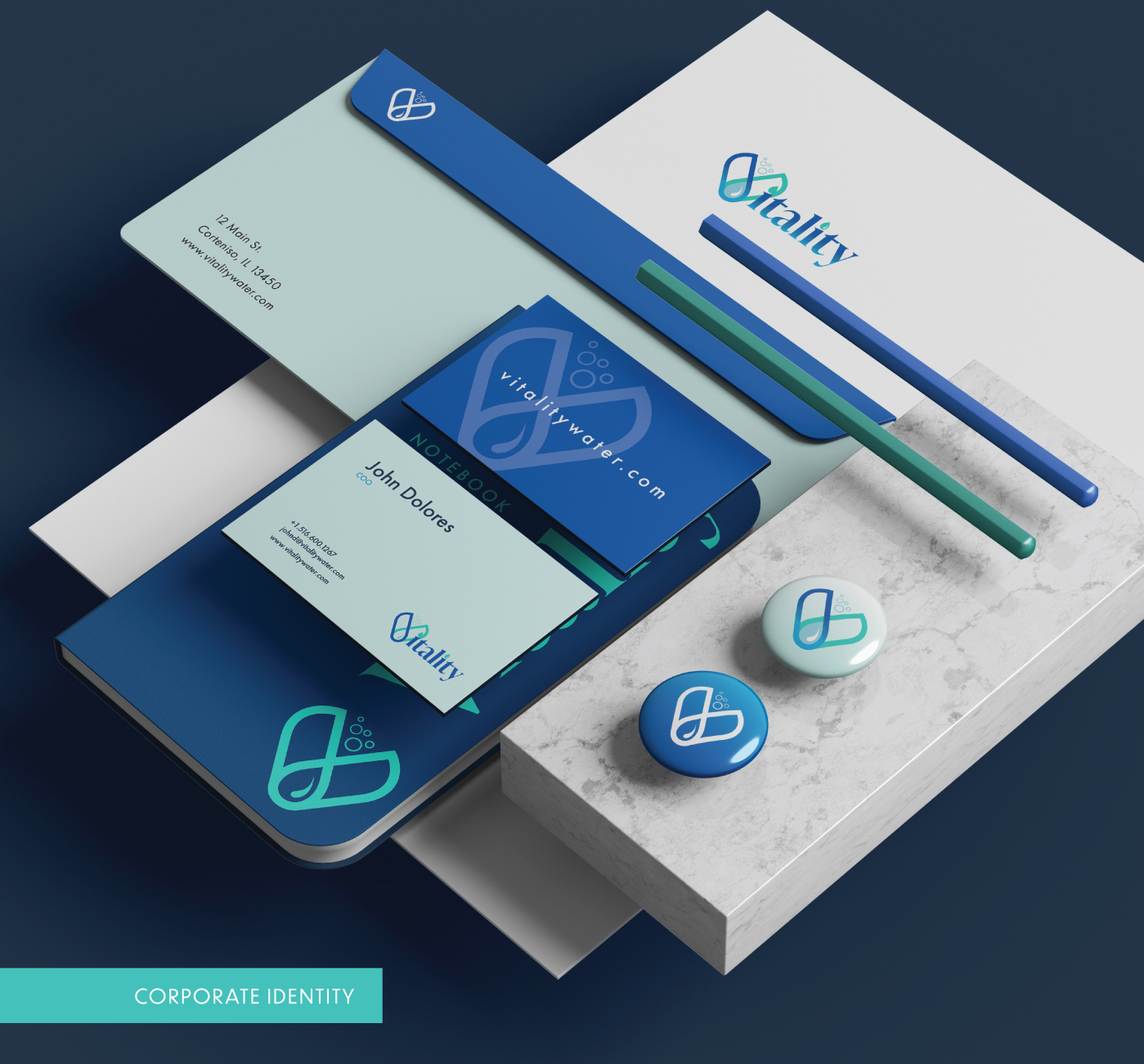
Advertising1st was contacted at the start of the year for a project showcasing mineral water. The project required us to create a name, logo, stationary, and promotional object application and develop a case study for a mineral water bottle.
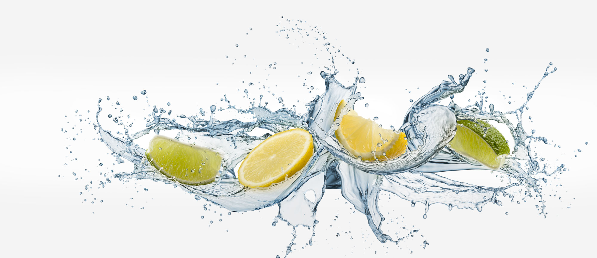
The objective of the design is to evoke a sense of necessity for mineral water by emphasizing its vital role in one's well-being and the vitality it provides. This goal was achieved through branding that showcases bubbles and droplets, highlighting the unique properties of the water.
Vitality Mineral Water
2022
Brand Name Creation
In creating the brand name, we focused on the idea that water is essential for life and provides energy, refreshment, and vitality. Therefore, the name we came up with is Vitality, which represents pure, mineral water sourced from the Carpathian Mountains and satisfies your thirst.
To achieve this goal, we developed the brand to evoke the feeling that mineral water is crucial for consumers' well-being and will provide them with the vitality they need. The design features bubbles and droplets from the water, highlighting its refreshing and energizing properties.
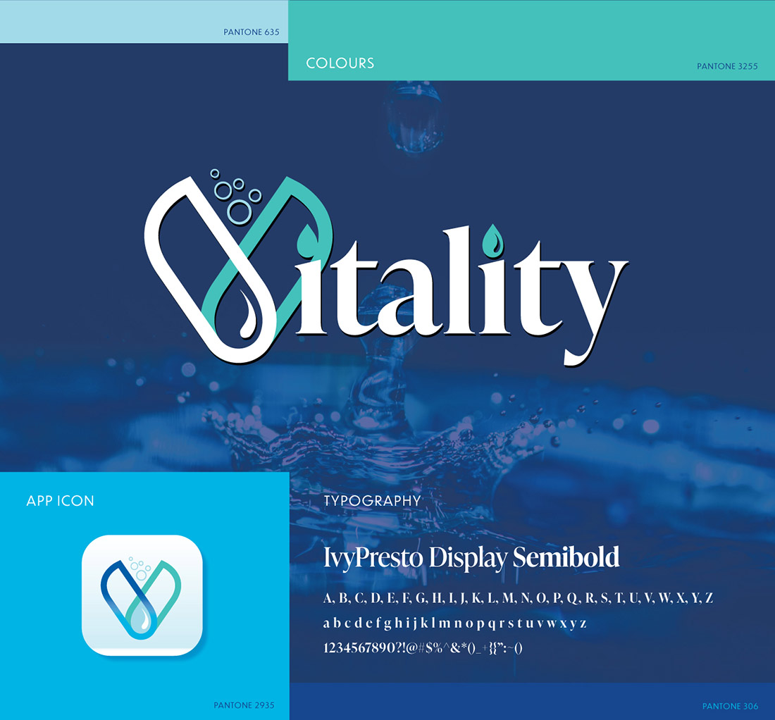
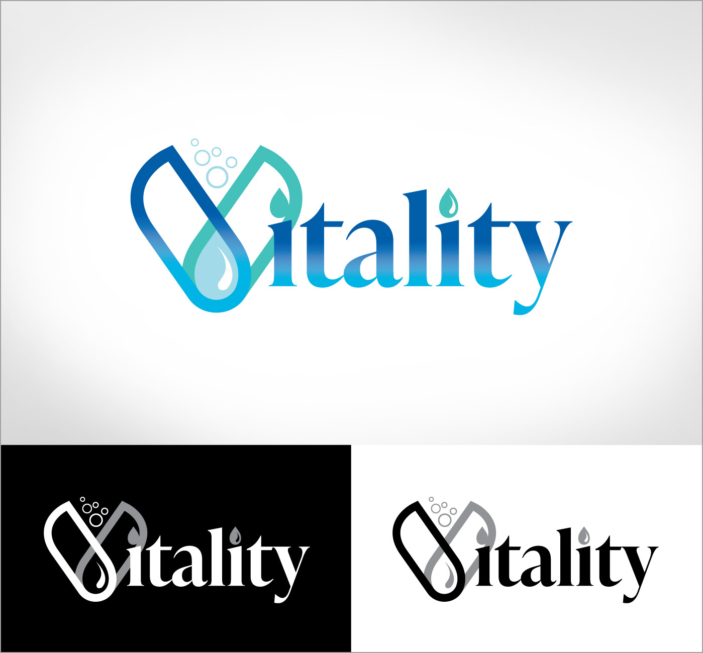
Logo Treatment - One, Two or Four Colours
We designed the Vitality logo to be versatile and adaptable for various printing methods and applications. It can be printed in four colours using Pantone or CMYK, but a two-colour logo or even a one-colour logo version can be used for cost-saving measures. The logo is both an icon and a complete logo in one, two, or four colours.
A gradient logo may be the best option for traditional printing and digital solutions, while one or two colours are more suitable for screen printing on signs, packaging, and clothing. On the other hand, a flat logo design can be effective for vehicle lettering and signs.
Each business must consider these various needs and choose the appropriate treatment for its logo. A professional approach to logo design will anticipate and incorporate these needs into the business branding design.
Logo Treatment - One, Two or Four Colours
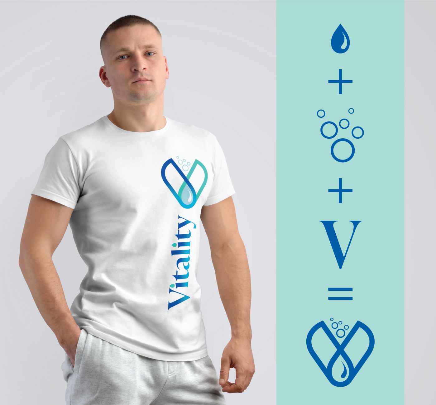
Please look at how we designed the Vitality logo and the graphic elements incorporated into its composition, including a water drop, water bullets, and a stylized "V."
Understanding the importance of trusting and relying on a designer, agency, or creative department within your company is vital. Beautifully designed products can set you apart from your competition and convey a clear and consistent message.
Vitality Mineral Water has already established a strong foundation, having designed an icon, logo, stationery, packaging, product bottle, and even an app icon for a potential native app. They have also laid the groundwork for a future website.
Logo Treatment - One, Two or Four Colours
Please look at how we designed the Vitality logo and the graphic elements incorporated into its composition, including a water drop, water bullets, and a stylized "V."
Understanding the importance of trusting and relying on a designer, agency, or creative department within your company is vital. Beautifully designed products can set you apart from your competition and convey a clear and consistent message.
Vitality Mineral Water has already established a strong foundation, having designed an icon, logo, stationery, packaging, product bottle, and even an app icon for a potential native app. They have also laid the groundwork for a future website.
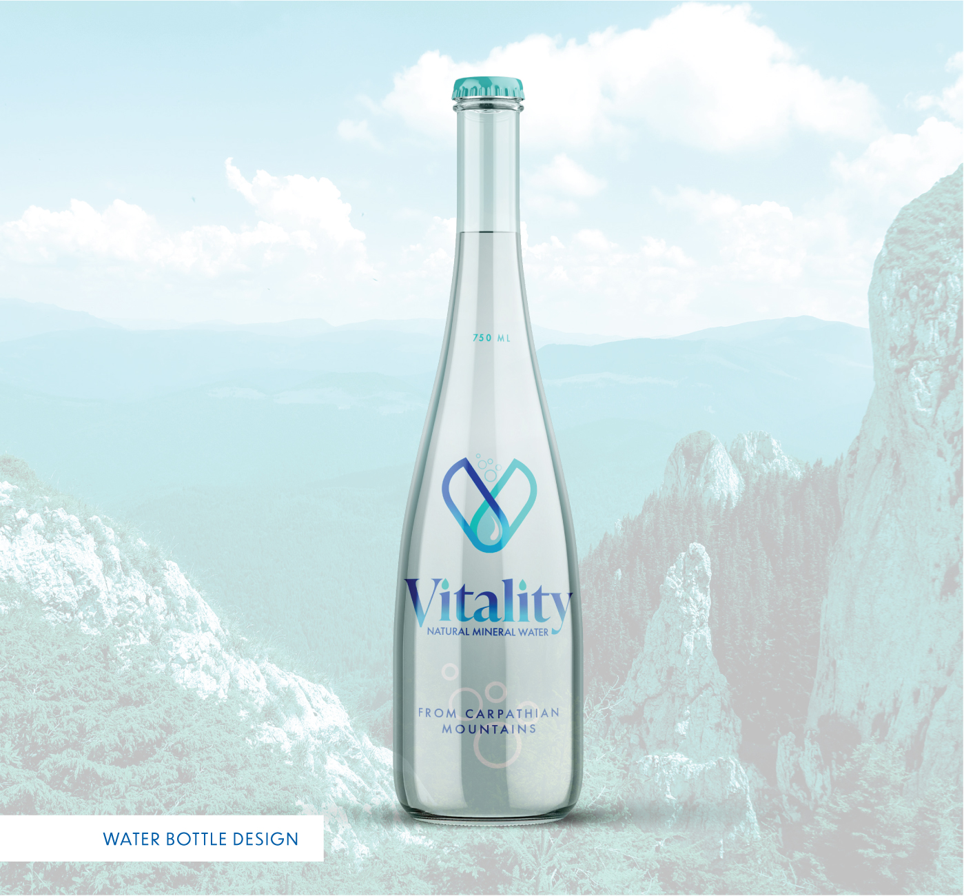
Package Design – 1L Bottle Concept
When designing the bottle for Vitality, Advertising1st opted for a clear, colourless bottle with screen-printed text instead of a paper label. As a result, the front displays only the essential information, while the back provides additional details without overwhelming the consumer.
In this design, the iconic V with bubbles plays a secondary role, while the Vitality logo is placed in a prominent central position. The bottle and mineral water source placement is thoughtfully arranged to allow the logo to stand out.