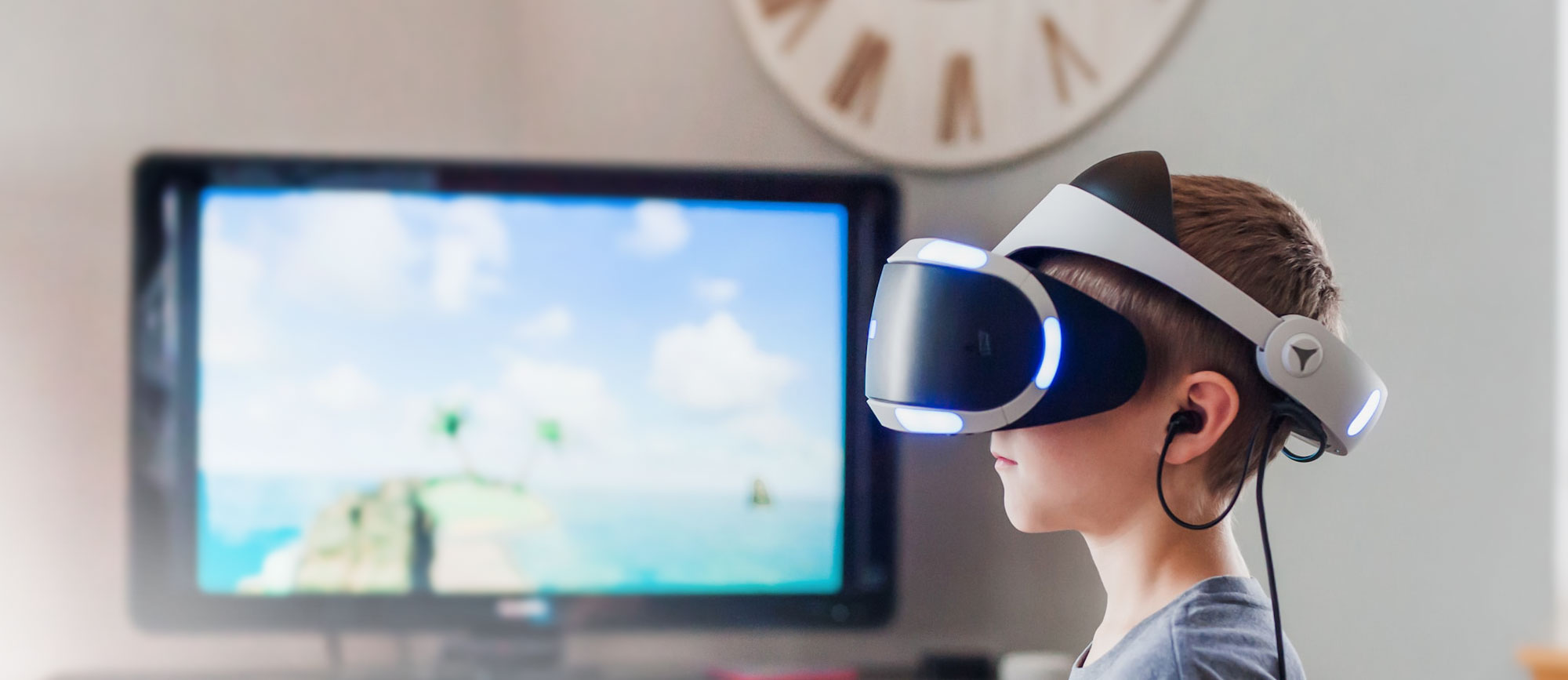
Dottech, based in Chicago, is dedicated to supporting the tech industry by showcasing, maintaining, and promoting its newest advancements, products, and services to the public. Dottech primarily focuses on businesses, start-ups, and individuals who believe technology effectively revolutionizes our operations and achieves tremendous success.
Our objective was to create a responsive website that provides users quick access to the latest information, advice, trends, and tools in the tech industry. In addition, I aimed to establish an online newspaper presence that is accessible anytime, anywhere and is supported by knowledgeable tech experts.
Dottech
2023
Corporate Identity
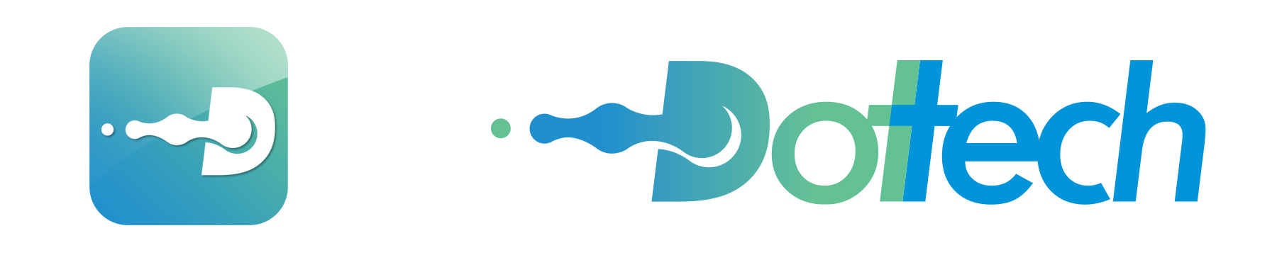
The foundation and starting point of the Tech industry can only be discussed by mentioning the pixel or the dot. Therefore, a medium is required to instigate such significant change and produce a technology-driven world where the primary element, a drop or a pixel, can impact change and foster interaction.
In designing the Dottech logo, we used dots with dynamic interactions between them and the word "tech." The initial letter of the word "Dottech" provides an ideal location for the dot interaction. The design can be employed as part of the word, separately as an icon, or even as an app icon.
Design Concept
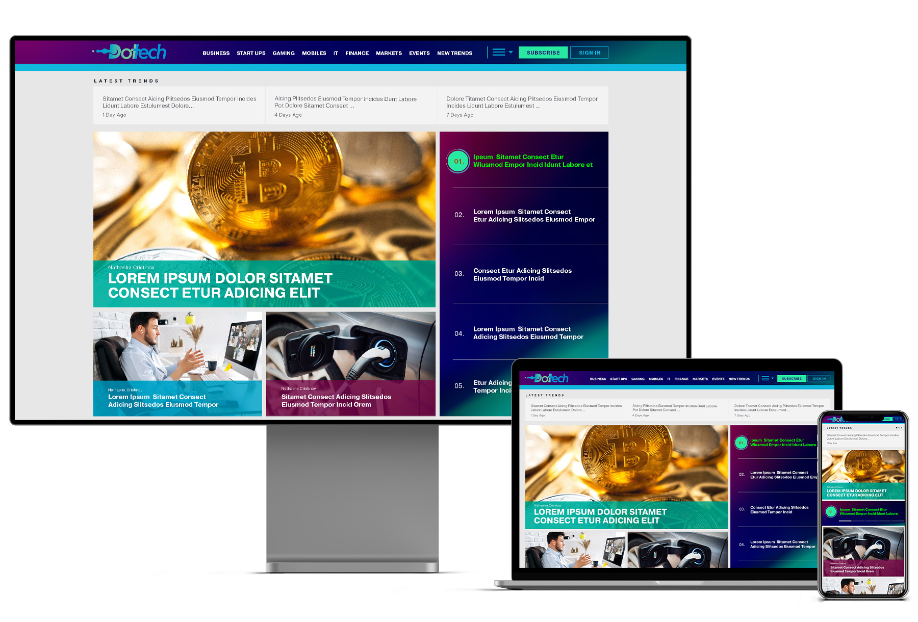
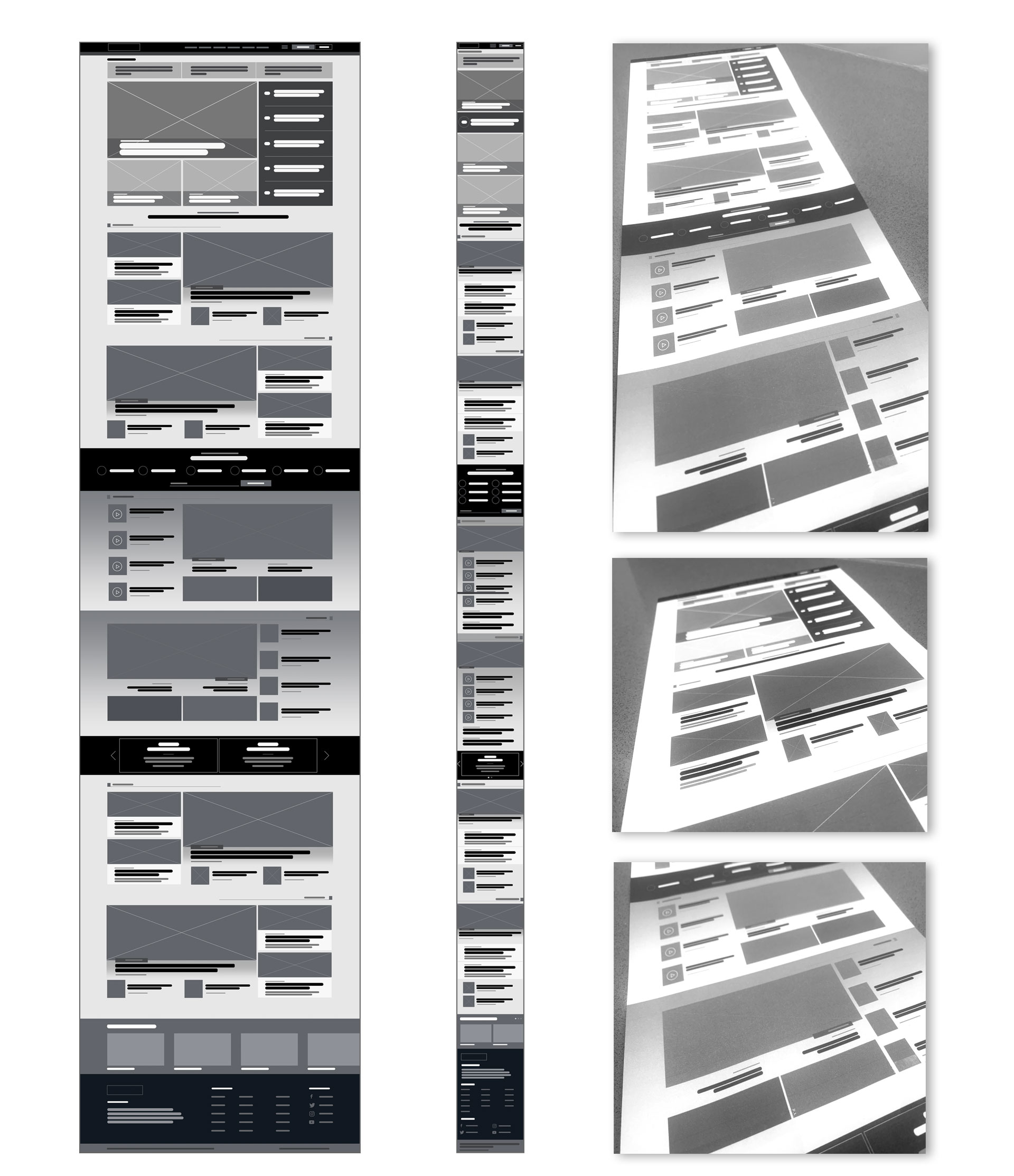
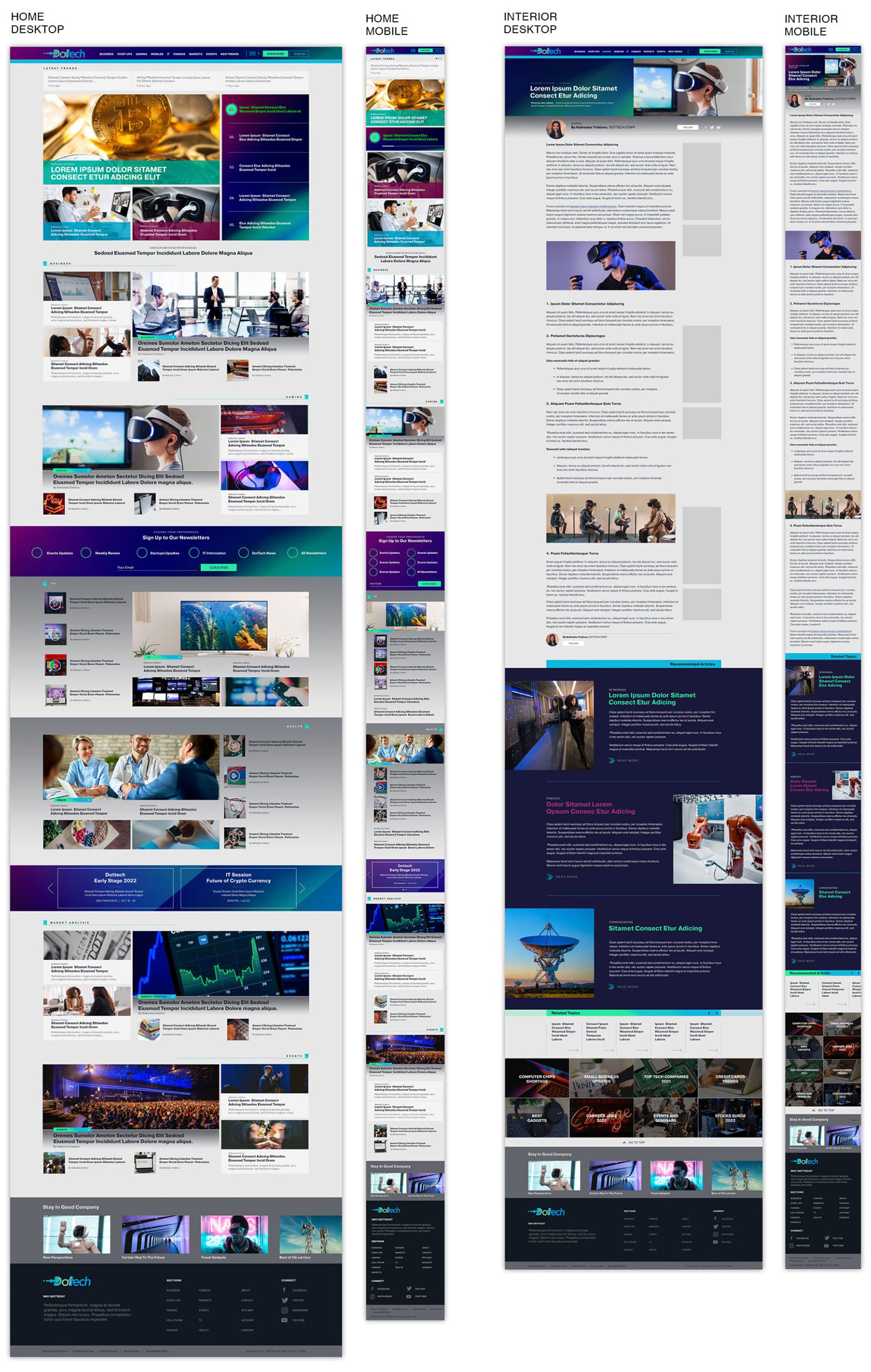
To organize a large amount of information, we divided information into smaller segments and created separate sections for related topics. The website's layout features a navigation menu and header, and above the fold, there is a rotating hero section that highlights five different featured areas on a central, larger view.
Two additional featured areas are displayed above the fold and showcase static information. Then, moving down to the content area, I created designated spots for articles related to Business, Gaming, Market Analysis, and Events. Finally, the design finishes with a footer section.
CONCEPT
Dottech is a platform that aggregates a vast amount of information from different sources. Therefore, one of the main challenges is presenting this information clearly and visually appealingly. To address this, I created a mirrored section that repeated multiple times and added some call-to-action elements to break up any potential monotony.
DESIGN
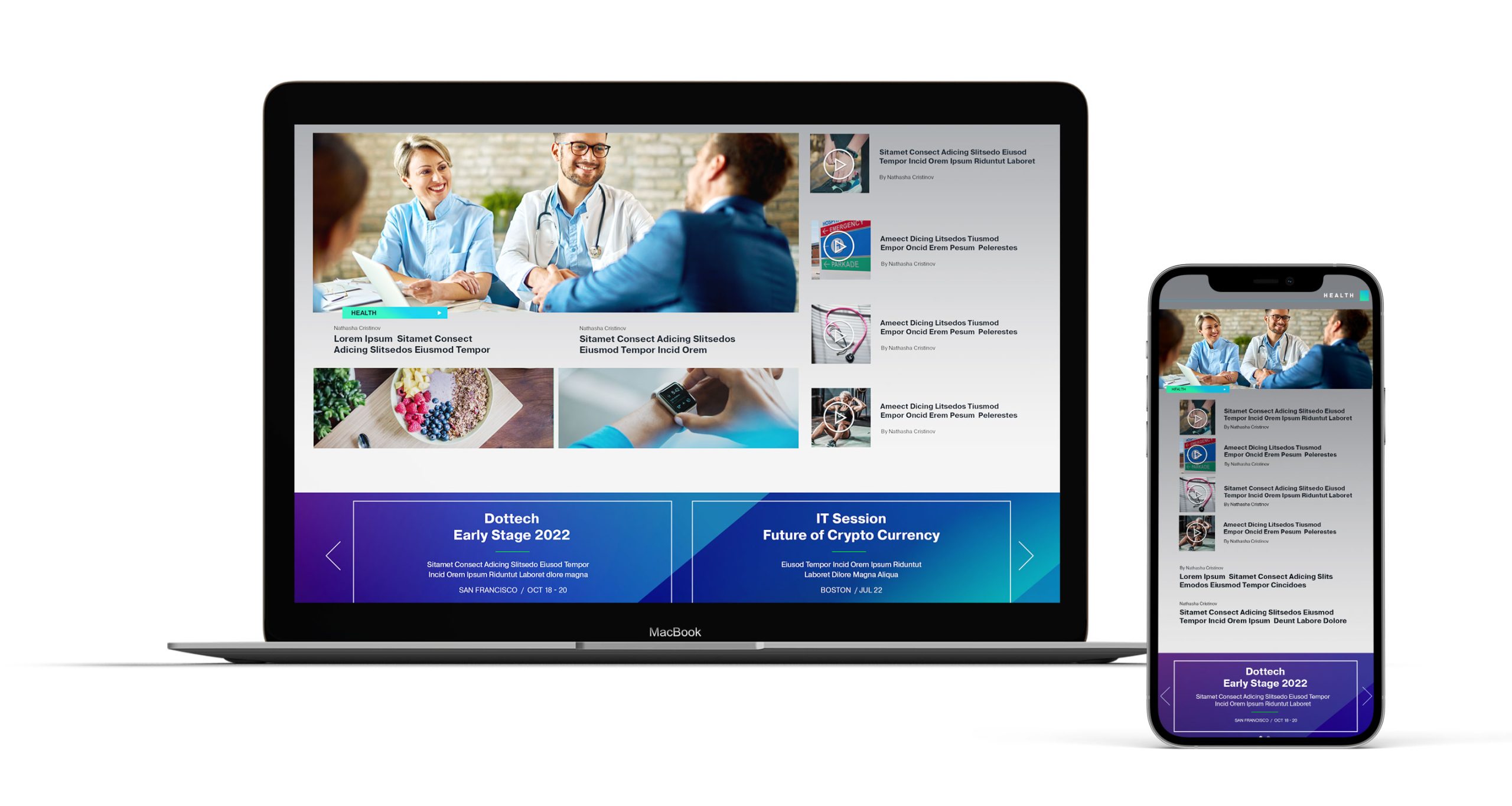
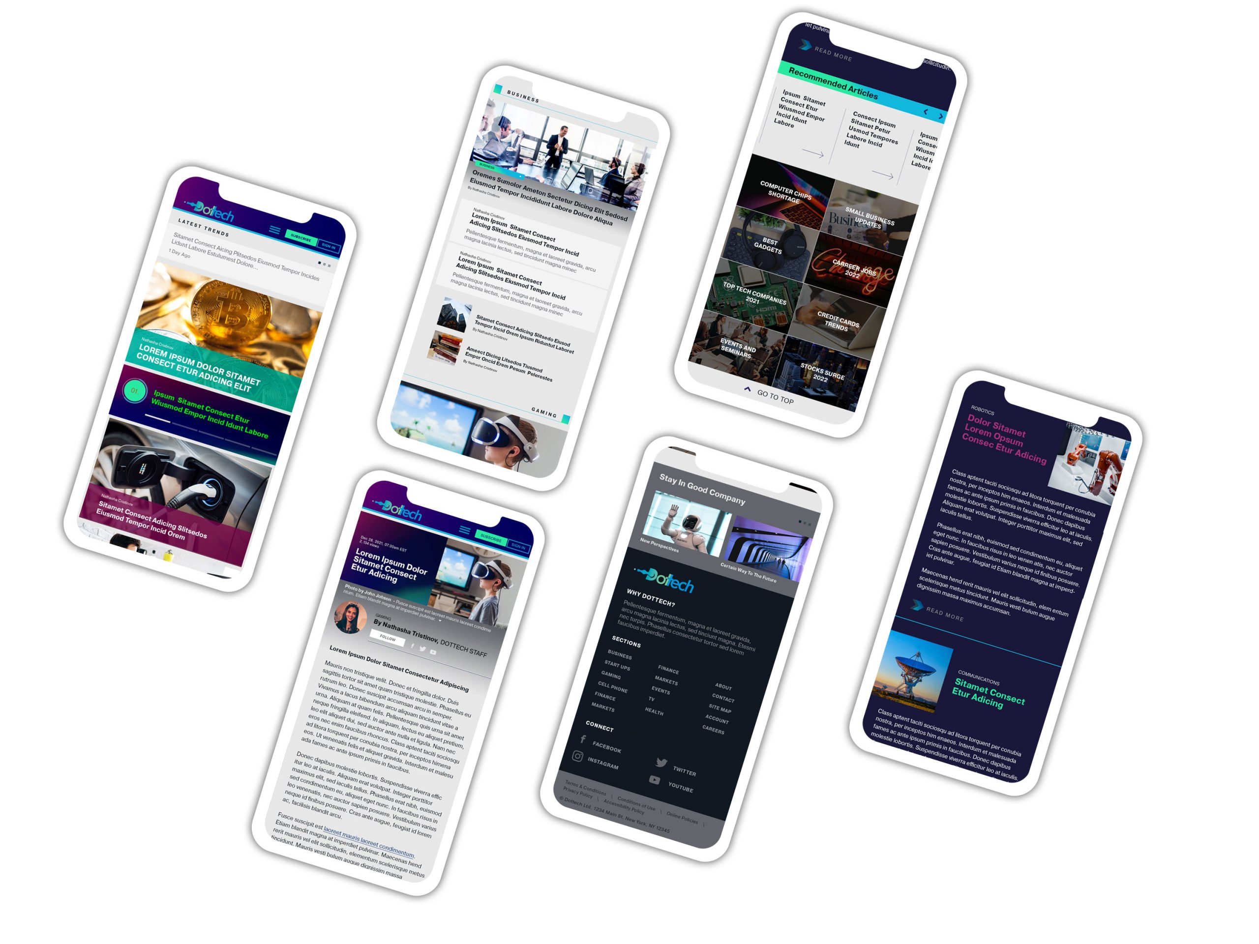
Balancing a mix of images and text and emphasizing the visuals, we placed the photos more prominent while keeping the accompanying text minimal, providing only a brief overview of the article's central message. By incorporating white space into the layout, the reader's eye is given room to "breathe" and focus on the news, allowing them to appreciate the content's value fully.
IMPLEMENTATION
Designing a tech portal is crucial for a responsive approach we wanted that the message is structured effectively. Some sections must be condensed or streamlined to minimize scrolling and download times. For example, in the mobile version the text will take priority over images to reduce download times and ensure the newsletter is easily accessible on smaller devices.
Takeways
The sheer amount of information required to create an efficient portal was huge, and it became apparent that structuring and presenting the content effectively was crucial. While the tech industry has been our lifelong passion, we realized that we would need the guidance of specialized experts to navigate this project successfully.
To meet specific standards more is needed to understand the subject matter; one must be exceptionally knowledgeable. Fortunately, I had the assistance of George Stapulos, a senior tech adviser whose expertise proved invaluable. I want to express my appreciation for his significant contributions to this project.
Your Brand Comes First
For a professional approach to your next project, don't hesitate to get in touch with Advertising1st